From Idea to Launch: How to Create an AI Dating App ...
Dating apps have changed how people meet and start relationships. Inst...

Nearly all of your competitors have websites that are not just exquisitely designed but also jam-packed to the gills with unique tools and functions. They do so much work on these websites for a specific purpose, increasing their visibility in the marketplace. It is due to the fact that today’s user spends most of their time browsing their smartphones.
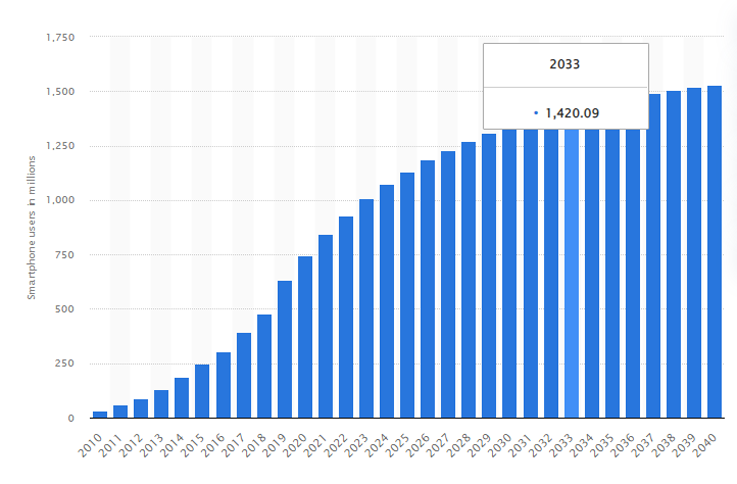
According to Statista, it was predicted that by 2020, over 748 million Indians would be using smartphones, and by 2040, that number would rise to more than 1.5 billion. Let’s take a look at the graph below for more clear stats.

Visitors can leave without exploring further if your website design is difficult to understand or unpleasant to look at. A website that is well-organized, simple to use, and enjoyable to read will encourage engagement and repeat visits. Despite the complexity of creating a functional and appealing website, avoiding these common pitfalls is a breeze.
Without further delay, let’s jump right in!
A poorly designed website can harm your business in many ways. Let’s take a look at what they are.
Even if you and your products are the best available on the market, no one will take you seriously. if your website does not reflect the same degree of knowledge and professionalism. 75% of people who visit a website will generate a judgment about the credibility of your business based on the appearance of the website that the company maintains. And this can give a huge impact on the ROI in the marketing of your business because you might lose your customers. To deal with this, deal with the design of your site while making it responsive. The quality of your company’s website will play a role in customers’ perceptions of your company and help you with your business.
If your website appears outdated, customers may believe that you are not up to date with current trends and, even worse, that you do not care about their requirements. If this is the case, your clients can sense that you aren’t up to date with current trends and aren’t putting enough emphasis on other elements of your company’s operations. If the content is outdated, users may wonder if they can still count on you as a resource.
Studies show that 59% of people are more likely to return to a site if it has a “beautiful and well-designed” layout. Before making a purchase, an overwhelming majority of customers now conduct research on the internet. When a customer leaves your website out of irritation because of broken links, an excessive amount of content, or an inability to find what they are looking for, you risk losing them permanently. Your prospective consumers may decide to do business with a rival company that offers the same products or services but has a website that is easier to navigate.
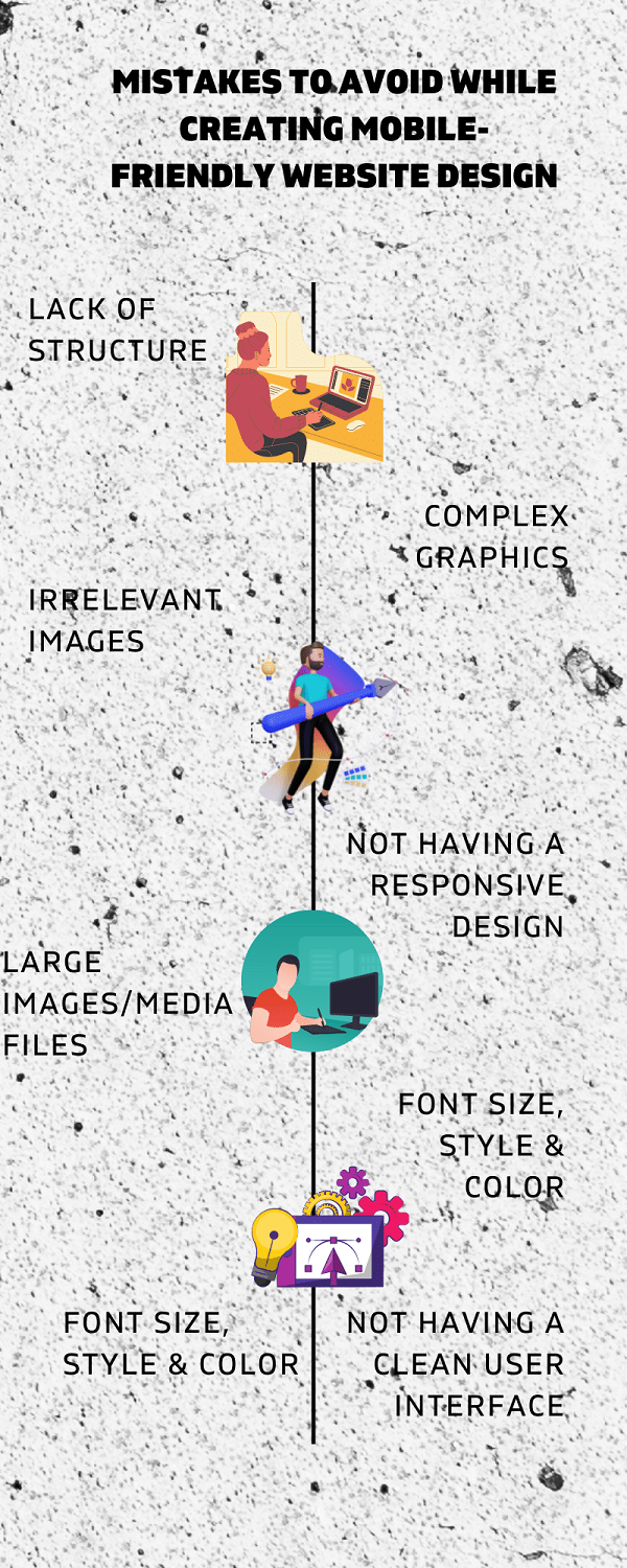
Here is the list of eight mobile-friendly website design mistakes that frustrate users, causing them to leave and go elsewhere.

Imagine visiting a website and finding nothing but plain text there. How do you think the customer will remember your site/business? Designing a website is only half the battle; you have to focus on the site’s structure. Customers who visit your website will immediately leave it if they don’t find it interesting. Adobe found that 68% of users will abandon a site that is not responsive and takes time to load.
To attract customers, designing with the right color palette is crucial. A suitable color scheme can help your website stand out, but garish hues and ugly patterns are a big no. What is it that most irritates people when they come to visit? Mobile-unfriendly websites that don’t adapt to the user’s device screen. Some 57% of visitors say they won’t share content from a site that isn’t mobile-friendly.
Avoid decorating your site with blinking animations and legions of gifs (Graphics Interchange Format). A graphic design of your website that is too cluttered draws attention away from the actual content and has the potential to irritate site visitors to the point that they will quit the site. When a website is well-organized, it is much simpler for users to explore and comprehend the content of the site. In addition, site users with poorer connections or who are using mobile devices may have problems if the website contains excessive design information that takes up too many terabytes of storage space.
In web design, images play a crucial role. After all, no one likes reading through swathes of text. Users don’t need to read every word on a page if they can look at an image that conveys the same message. However, proper image integration is essential. The use of blurry, poorly lit, or irrelevant photos is a trademark of poorly designed websites.
If you choose pictures with nothing to do with the content, your viewers will be lost and unsure of what you’re trying to say. They may become irritated and shut down entirely. Similarly, if you utilize low-quality images on your website, it won’t look as polished and professional as you’d like, and visitors might start to doubt your credibility.
If you want to give your customers an omnichannel experience, the design of your website needs to be responsive and consistent across all browsers and devices. When developing websites, it is a common practice to make the error of creating separate user journeys and plans for each platform and device. Maintaining consistency across all platforms and hardware should be a primary focus. It is recommended to test the response in a contained way before putting it into production. Currently, tools are available that make it simple to develop websites that can adjust themselves to fit various screen sizes.
A website’s loading time will increase if it has numerous or huge photos. As a result, your overall page load time can increase, both annoying to users and detrimental to your site’s position in search engine results. Although a picture is worth a thousand words, slow loading times will make them useless.
Aim for a page load time of three seconds or less to deliver the most incredible user experience possible. You can easily avoid the big file images, but you can’t afford to let that be the downfall of your company. Your website’s bounce rate reflects the visitors who quickly leave your page. Your Google page rank is affected by your image quality because of your bounce rate.
It’s a significant issue if your blog readers cannot understand the text or the primary menus. Use the most legible combination of colors and typefaces possible so that visitors can acquire as much information as possible from your site with little effort. Mobile users will abandon your CTA before clicking through without appropriately sized and formatted fonts.
Ensure the contrast between the text and the background isn’t too high and that users can easily read your content without distraction. Mobile users, who rely on the website’s responsiveness to format paragraphs automatically to fit the unconventional shape of their viewing dimensions, also find text extremely significant. Mobile customers will have a terrible experience reading your content line by line if your website is not responsive.
One of the biggest mistakes you can make for your business is not having a responsive website design. Google highly recommends that you make your website mobile-friendly. The term “responsive web design” refers to creating sites that can adapt their display according to the viewing device. This layout makes it possible for the website to respond to each browser’s capabilities. Through media queries and flexible images, responsive web design may make websites adapt their visual presentation to the screen size of the user’s device, improving usability.
By paying more attention to the layout of the menu on your website, you could significantly enhance the experience users have while accessing your site from mobile devices. More people will visit your business if you have a mobile menu that is easy to navigate. Users are more likely to use the numerous settings that are accessible to them since the mobile menu makes it simple for them to switch between menu tabs by touching the tab sign located in the top left corner of the screen. The page managers of the public website can select which mobile devices, including phones and tablets, will display the mobile menu.
You will now understand the importance of having a well-designed website and the common pitfalls to avoid when doing so. Your website is one of your company’s most valuable assets. A tiny mistake in your website can impact your business and product reputation. That’s why every enterprise must make a good first impression. But you won’t get very far if you make the same mistakes your potential customers do. However, if you still have trouble with your website’s design or redesign despite our typical pitfalls, don’t hesitate to contact our highly skilled website design company, which can help you stand out from the crowd.