How to Get Your Law Firm Website Ranked on ChatGPT a...
When someone needs a lawyer today, the journey often does not start wi...

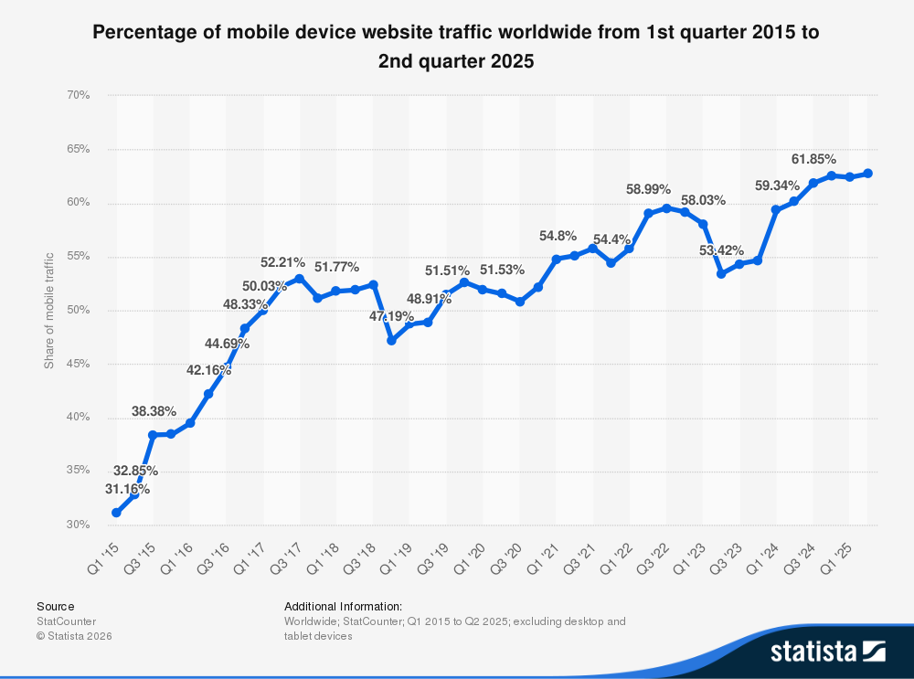
Mobile devices now dominate how people access the internet. Today, smartphones generate more than half of global website traffic, making mobile usability a critical factor in how users experience digital products.
This shift has made website responsiveness a fundamental requirement for modern websites. A responsive website automatically adjusts its layout, images, and navigation to fit different screen sizes, whether a user is browsing on a smartphone, tablet, or desktop computer.
The graph below shows how mobile device traffic has steadily grown over the past few years. According to Statista, mobile devices now account for a significant share of global website traffic.

As mobile usage continues to rise, businesses must ensure their websites deliver a consistent experience across devices. Responsive design helps achieve this by adapting the user interface to different resolutions and platforms.
In this article, we will explore what website responsiveness means, why it matters for businesses, and how to test whether your website performs correctly across different devices.
Website responsiveness refers to a web design approach that allows a website to automatically adjust its layout and content based on the screen size and device being used. A responsive website ensures that pages display properly whether a visitor is browsing on a smartphone, tablet, laptop, or desktop computer.
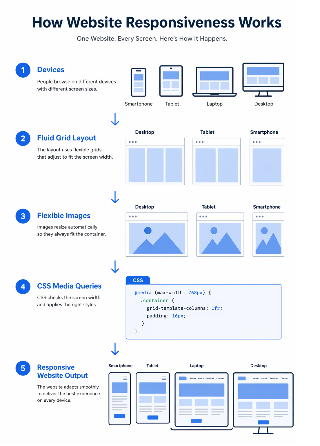
Responsive web design typically relies on flexible grids, responsive images, and CSS media queries. These technologies allow page elements to resize and reposition themselves according to the dimensions of the user’s screen.
Instead of using fixed-width layouts, responsive websites use fluid grids and percentage-based sizing. This allows the layout to scale smoothly across different screen resolutions while maintaining readability and usability.
Media queries in CSS help developers apply different styling rules depending on the device or screen width. For example, navigation menus, images, and page sections can automatically adjust to provide a better experience on smaller screens.
Because of responsive design, businesses no longer need to build separate mobile versions of their websites. A single responsive website can deliver a consistent user experience across all devices while keeping development and maintenance simpler.
Website responsiveness is achieved through a combination of design and front-end development techniques that allow a website to adapt to different screen sizes and devices.
Modern responsive websites typically rely on three core components.
Responsive layouts use flexible grid systems that scale proportionally instead of relying on fixed pixel widths. This allows page elements such as columns, images, and content blocks to resize automatically depending on the screen size.
Images, videos, and other media elements are designed to scale within their containers so that they remain visible and properly aligned on different screen resolutions. This prevents layout breakage and improves visual consistency across devices.
Media queries allow developers to apply different CSS styles based on screen width, orientation, or device characteristics. For example, a multi-column desktop layout can automatically switch to a single-column layout on smartphones.
Together, these techniques enable a website to provide a consistent user experience regardless of the device being used to access it.

Even when a website is designed with responsive principles, certain issues can still appear across different devices and screen sizes. Identifying these problems early helps ensure a consistent user experience.
Regular testing across multiple devices helps identify these issues early so they can be corrected before affecting users.
If a website is not responsive, it often becomes difficult to use on smaller screens. Users may need to zoom in, scroll horizontally, or struggle to tap buttons and navigation elements. In many cases, images, tables, and layouts break when viewed on mobile devices, making the content hard to read.
When this happens, users typically leave the site quickly. A poor mobile experience increases bounce rates and can result in lost leads and missed business opportunities. Responsive design helps prevent these issues by ensuring the website adapts smoothly to different screen sizes and devices.
Responsive design testing ensures that a website performs consistently across smartphones, tablets, and desktops. Below are some of the key reasons why testing website responsiveness is important.
Internet usage on smartphones and tablets has grown rapidly over the past decade. Users now expect websites to work seamlessly across devices without being redirected to separate mobile versions. Responsive design allows businesses to maintain a single website that adapts to different screen sizes while reaching a wider audience.
A consistent user experience across devices improves engagement and encourages users to take action. Effective responsive design is closely connected with good UI/UX design, ensuring that navigation, layouts, and interactions remain intuitive across different screen sizes.
Search engines prioritize mobile-friendly websites in search results. Responsive design helps improve SEO by allowing businesses to maintain a single website and URL structure across devices. This simplifies content management and ensures search engines can crawl and index the site more effectively.
Maintaining one responsive website is more efficient than managing separate desktop and mobile versions. Updates, design changes, and content management can all be handled within a single system, which saves time and reduces long-term maintenance costs.
Modern web technologies allow some content to remain accessible even when users temporarily lose internet connectivity. Responsive design ensures that content is structured in a way that remains usable across different devices and environments.
When testing a responsive website, developers and QA teams verify that the layout, content, and functionality work correctly across different screen sizes and devices. Below are some common test cases used to evaluate website responsiveness.
Responsive testing also includes checking how the website behaves when a device changes orientation from portrait to landscape. In addition, testers verify that navigation, links, and buttons function correctly across all supported devices and browsers.
Testing website responsiveness ensures that your website adapts correctly to different screen sizes and devices. During the web development process, responsive testing helps identify layout and usability issues before a website is launched.
If you want to implement a responsive layout for your website, you can learn more about responsive design and how it helps websites adapt to different devices.
There are two common ways developers and testers verify responsive behavior.
Modern browsers such as Chrome and Firefox provide built-in developer tools that make it easy to test responsive layouts. These tools allow you to simulate different screen sizes and mobile devices directly within the browser.
You can open developer tools using the F12 key. Once the tools are open, enable the Toggle Device Toolbar option to switch to responsive testing mode. In Firefox, this feature is called Responsive Design Mode.
This mode provides a list of common devices such as smartphones and tablets. You can instantly preview how the website appears on different devices and also adjust screen resolutions manually to test various breakpoints.
It is not practical to test a website on every device and operating system available. Instead, testing should focus on the devices, browsers, and screen sizes most commonly used by your target audience.
This approach ensures that the website provides a consistent experience across the devices most relevant to your audience.
Responsinator is a simple web-based tool that helps developers quickly preview how a website appears on different screen sizes. By entering a website URL, users can instantly see how the page renders across several common device layouts.
Key advantages of Responsinator include:
Responsinator is best suited for fast visual testing. Developers still need to perform additional testing across real devices and browsers for complete validation.
Testsigma is an automated testing platform that supports responsive and cross-browser testing for modern web applications. It allows teams to run automated tests across a large combination of browsers, operating systems, and mobile devices.
Some notable features of Testsigma include:
Testsigma is particularly useful for teams managing large web applications that require frequent regression and UI testing.
LambdaTest is a popular cloud-based platform for cross-browser and responsive testing. It provides access to a wide range of browsers and real device environments that allow developers to verify how websites behave across different screen sizes.
Key features of LambdaTest include:
LambdaTest is commonly used by development teams that need to test websites across many environments without maintaining their own device labs.
Am I Responsive is a lightweight tool that allows users to quickly preview how a website appears across multiple device screen sizes at the same time. The tool displays a website within frames representing desktop, laptop, tablet, and mobile devices.
Useful features include:
This tool is best used for quick visual demonstrations rather than detailed device testing.
LT Browser is a responsive testing browser developed by LambdaTest. It allows developers to test websites across multiple device viewports simultaneously while debugging layout and performance issues.
Some notable capabilities include:
LT Browser is useful for developers who want a dedicated testing environment focused on responsive design.
Website responsiveness refers to the ability of a website to automatically adapt its layout, images, and content to different screen sizes and devices. A responsive website provides a consistent experience across smartphones, tablets, laptops, and desktop computers.
Website responsiveness improves user experience by ensuring that visitors can easily navigate and interact with a site on any device. It also supports better SEO performance since search engines prioritize mobile-friendly websites in search results.
You can test website responsiveness using browser developer tools, responsive testing tools, or by manually checking the site on multiple devices and screen sizes. These methods help identify layout issues and usability problems.
Responsive design automatically adjusts a website’s layout to fit different screen sizes using flexible grids and media queries. Mobile-friendly design, on the other hand, refers to websites that work on mobile devices but may not fully adapt their layouts across all screen sizes.
The importance of user experience cannot be overstated. Visitors expect websites to work smoothly across smartphones, tablets, laptops, and desktop computers. If a website fails to adapt to different screen sizes, users are likely to leave quickly and search for alternatives.
Ensuring proper website responsiveness helps businesses deliver a consistent experience across devices while improving usability, engagement, and search visibility. By testing layouts, images, navigation, and interactive elements across multiple devices, teams can identify issues early and ensure that the website performs reliably for all users.
Responsive testing should be a regular part of website development and maintenance. A well-tested responsive website not only improves user satisfaction but also supports long-term digital growth.
If you need help implementing responsive layouts or improving mobile usability, working with an experienced web design company can help ensure your website delivers a consistent experience across devices.
Anshum Chauhan
Anshum is a dynamic project manager. She knows project management, process engineering, project planning, teambuilding, risk management, communication, and technical organisational change implementations. She enjoys music, tech, and playing with her son while not working.